A UI design of the Slimming World App homescreen

Slimming World

Unifying our member platforms

Migrating 900K members from a legacy platform to a new platform, as pain free as possible.

Industry: Retail, Ecommerce

Role: Senior UX Designer

Tools: Figma, Miro, Contentsquare

Approach: Research & Design

Summary: The successful migration of all member accounts onto a single platform helped save 2 million a year on maintaining legacy platorms whilsts also providing an aligned and elevated user experience for both digital and group members.

The Brief Migration

Towards the end of 2018, Slimming World rolled out a brand new digital service for all of its Digital Only members (both web and mobile apps).

The first couple of months were used to iron out any issues with the platform before working on a process to migrate the lions share of users. Our Group members. These members were still using the legacy platform that had been running for some time now and water was leaking at the cracks!

My role

I was the UX Architect, supporting two scrum teams that included product managers, product owners, developers, QA testers and UI designers.

The Challenge Adapting the platform

To give you some background into Slimming World: Group members who have joined the service, attend a weekly session ran by a consultant within their local area (most of the time consultants are past members who are well versed in the Slimming World weight loss program), who offer support and encouragement to Group members and their weight loss journey.

Migrating these Group members from the existing platform to the new one, came with a set of challenges, that turned into 25 smaller projects (in this case study I have selected some of the work involved within these projects).

The high-level goals were to:

The Process Slowing down to speed up

Facilitating discussions

With me recently joining Slimming World, I had to quickly understand the business, and how the platforms served members, I also needed to understand how the historical decisions around the service came about. With minimal documentation, it meant I had to speak to various domain experts within the business to understand business rules, and in general just how things ticked/worked in the digital department.

Flows

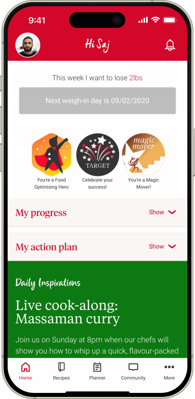
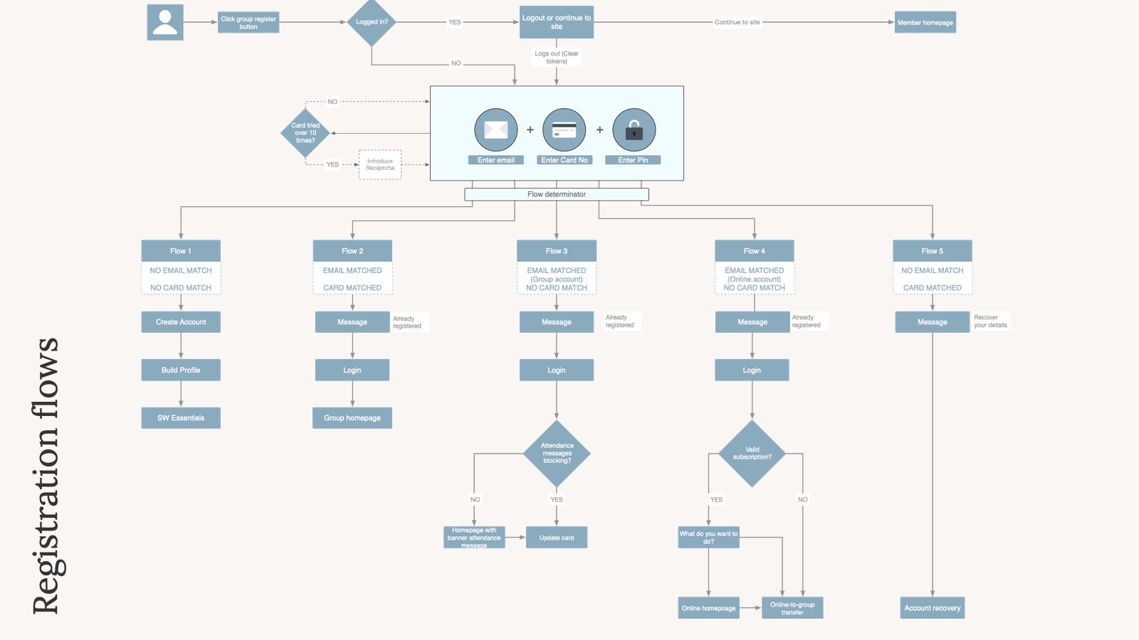
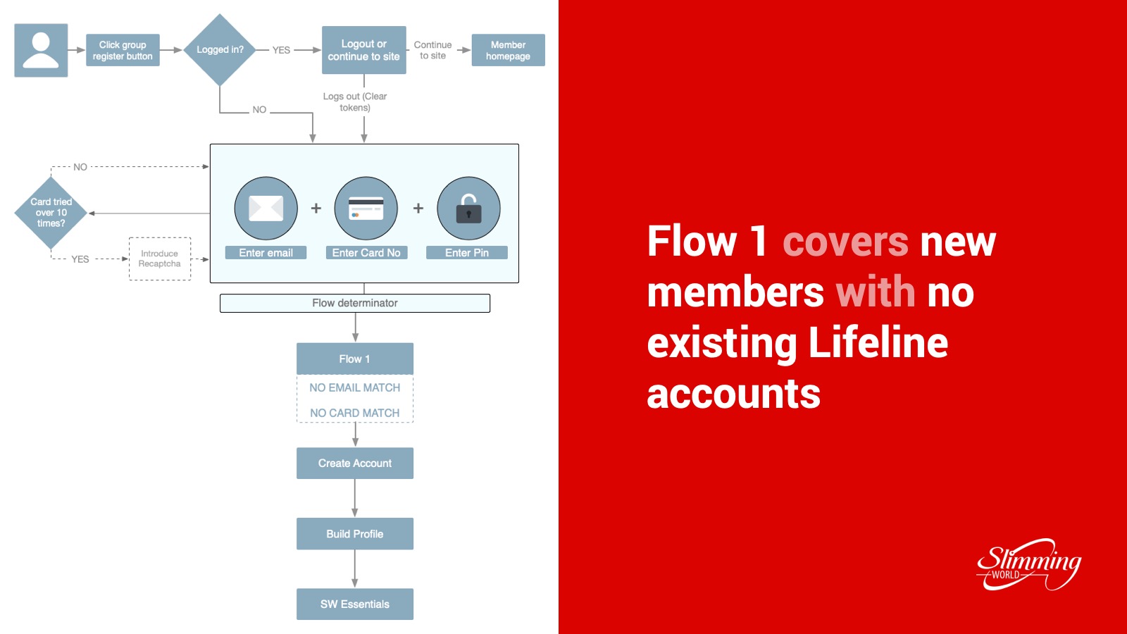
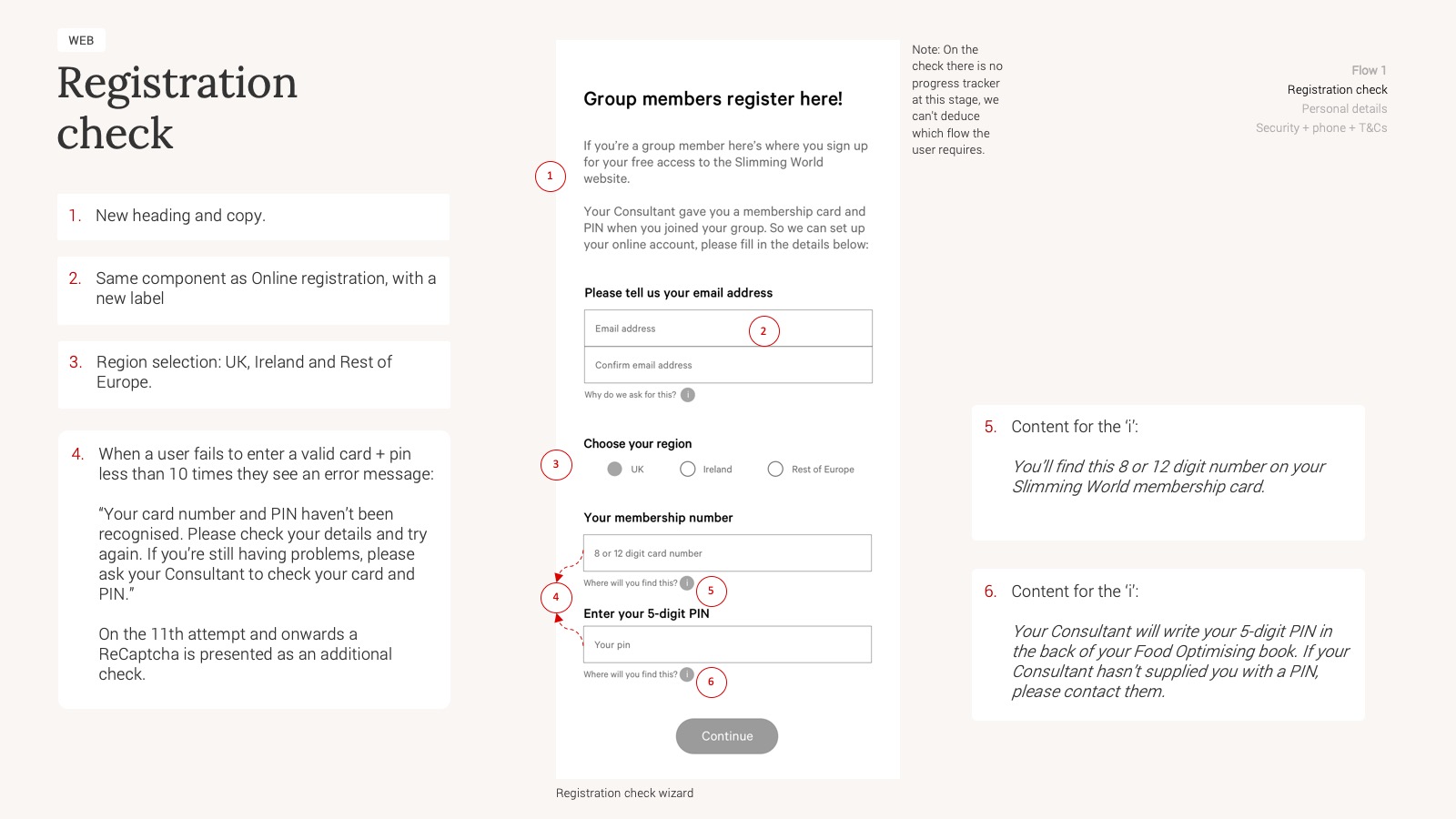
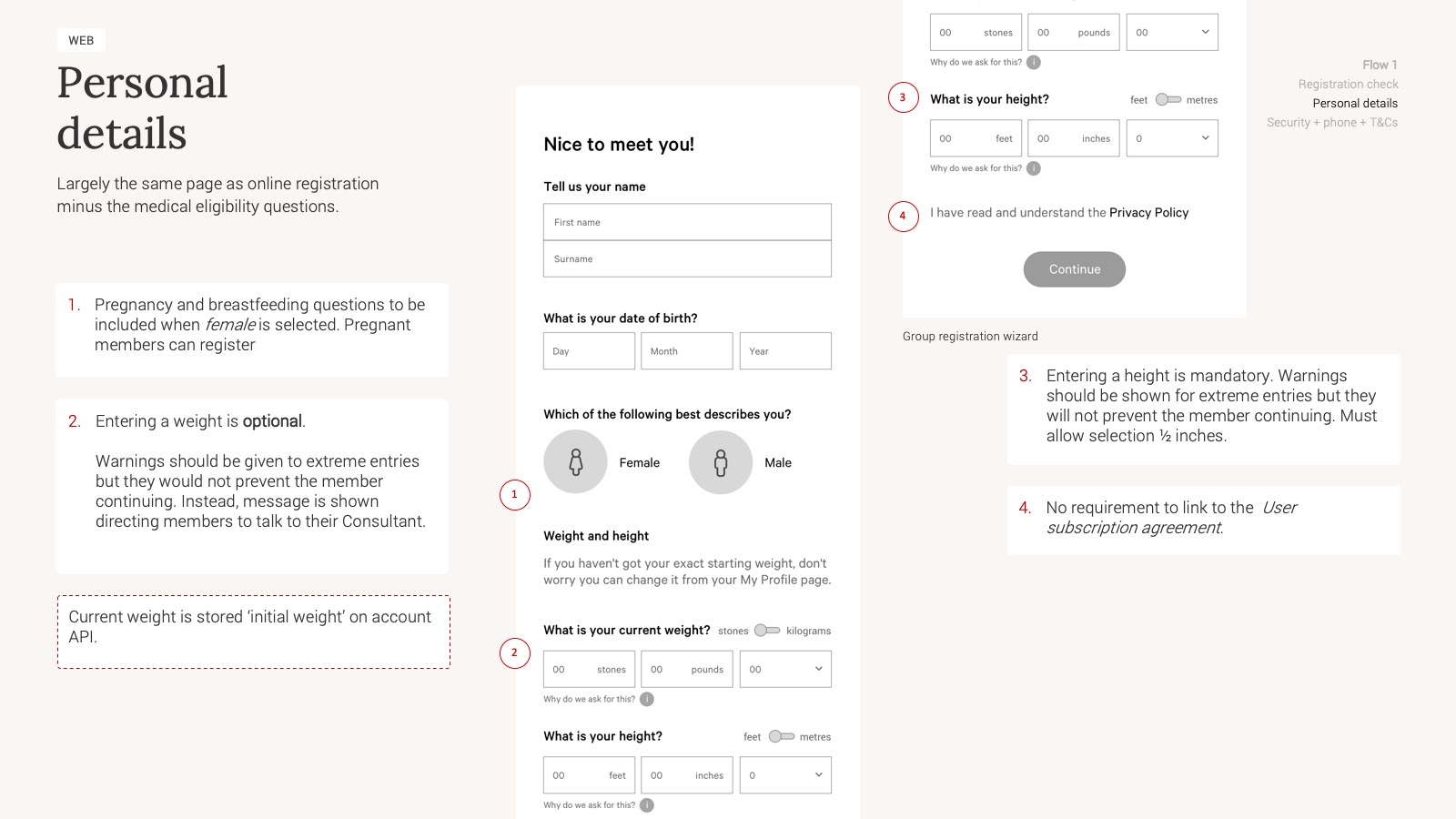
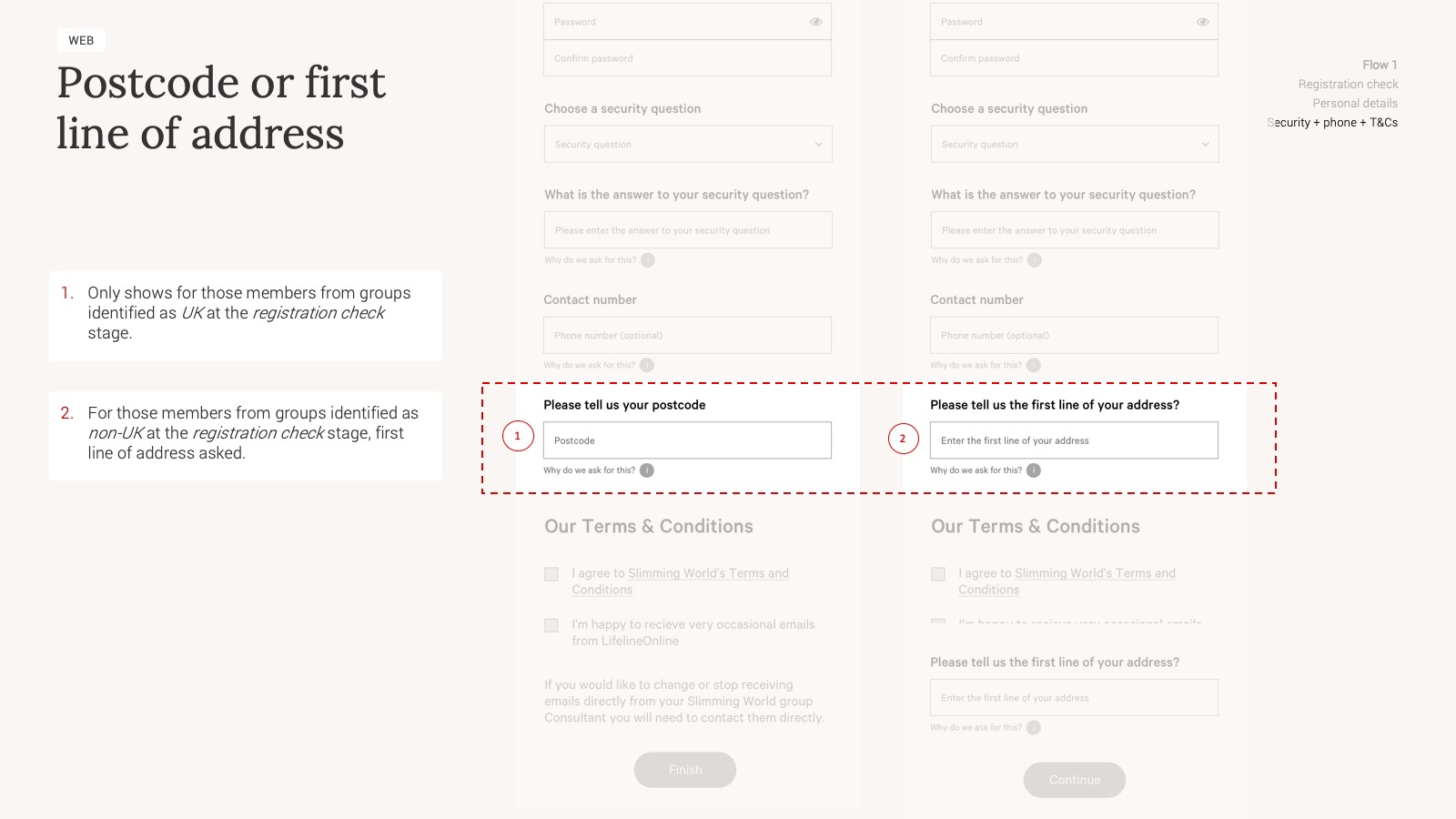
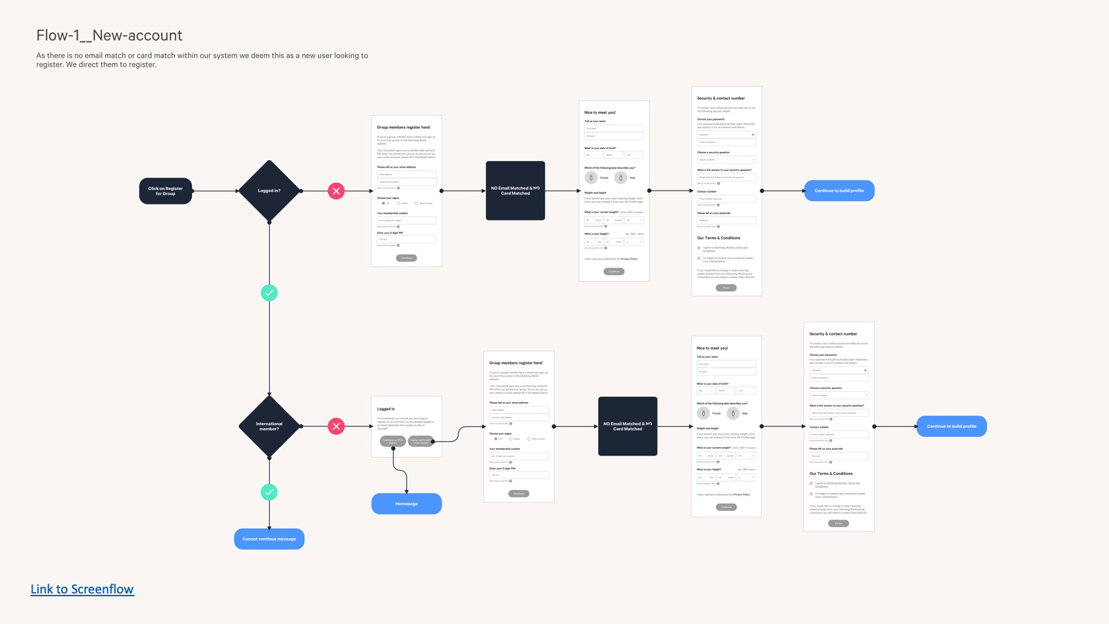
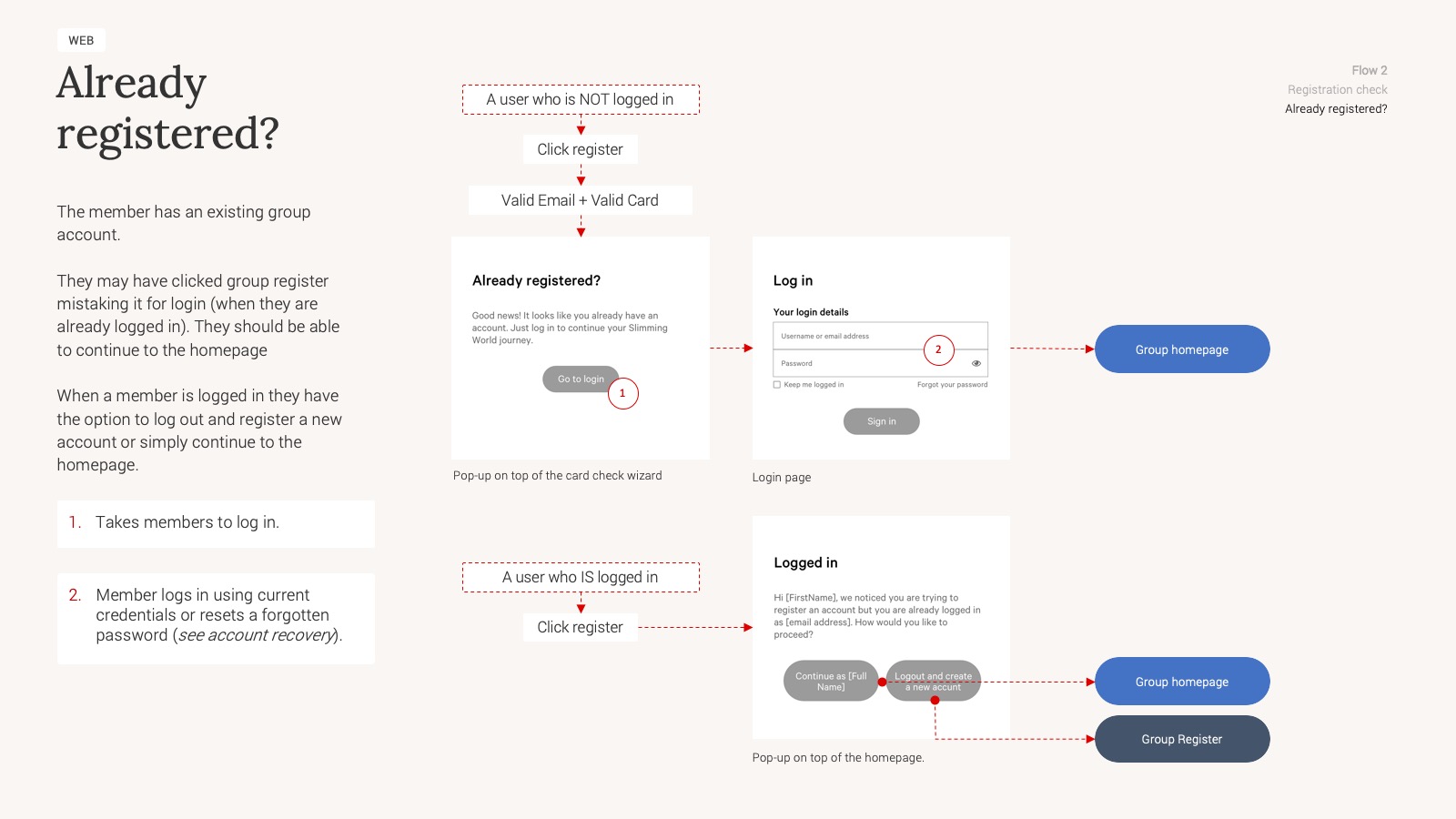
A big part of my initial work involved mapping and documenting current-as-is journeys for our Online members who were currently using the platform. This gave us a starting point to go on and understand how these flows would need adapting to handle Group members. I setup meetings with product owners and stakeholders to run through the current-as-is flows, to confirm accuracy, as well as ideas on how Group adaptations could fit in. These meetings also took place with the wider digital team to gain understanding of business and technical constraints, which in turn helped me develop the initial concepts.

Wireframes

I discussed wireframes, low fidelity mockups to stakeholders and then produced high fidelity mockups before creating prototypes for usability testing.

Business rules

As part of the UX documentation, business rules documentation was also created to support the development teams in understanding how to align the codebase accordingly.

— Each UX documentation came as a presentation deck.
— An overview of the various registration scenarios.
— Breaking down each flow with further detail
— Annotated wireframes
— Another annotated wireframe
— Showing input variations based on user address
— Overview of screen-flows to aid developers
—/ Journeys based on users state

The Results Migration ready

The UX, development and testing has been completed. The next stage is to is open the migration process on with a regional rollout per week. This will help monitor and manage any contact that comes through to our support team, with the aim of picking up any pain points early. If all is working as planned we aim to ramp up the migration regions and aim to have it completed for April.

Back to sajhd.com

View case study